Alex Boerner Photography
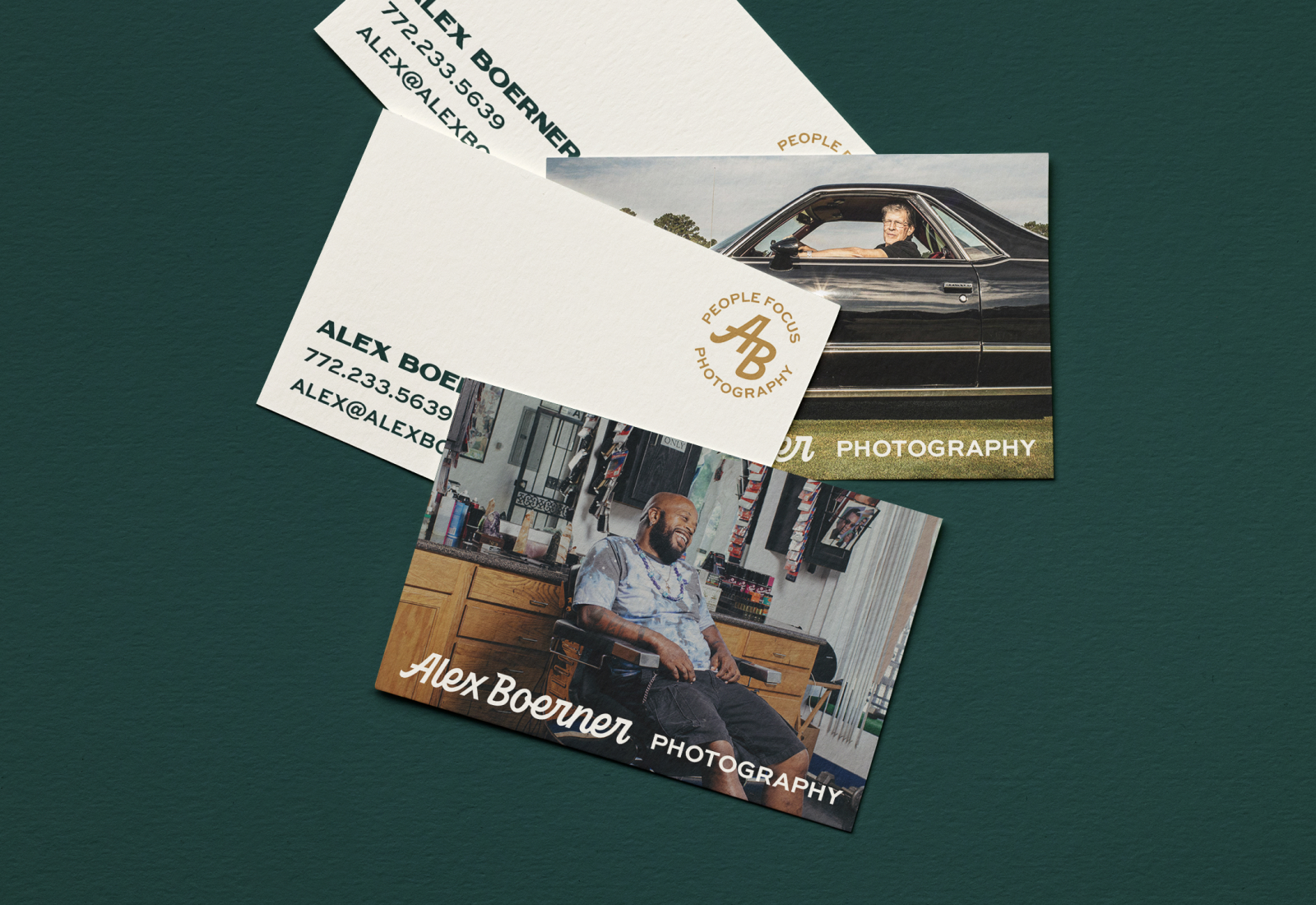
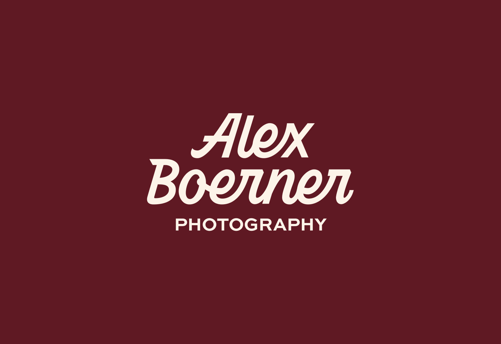
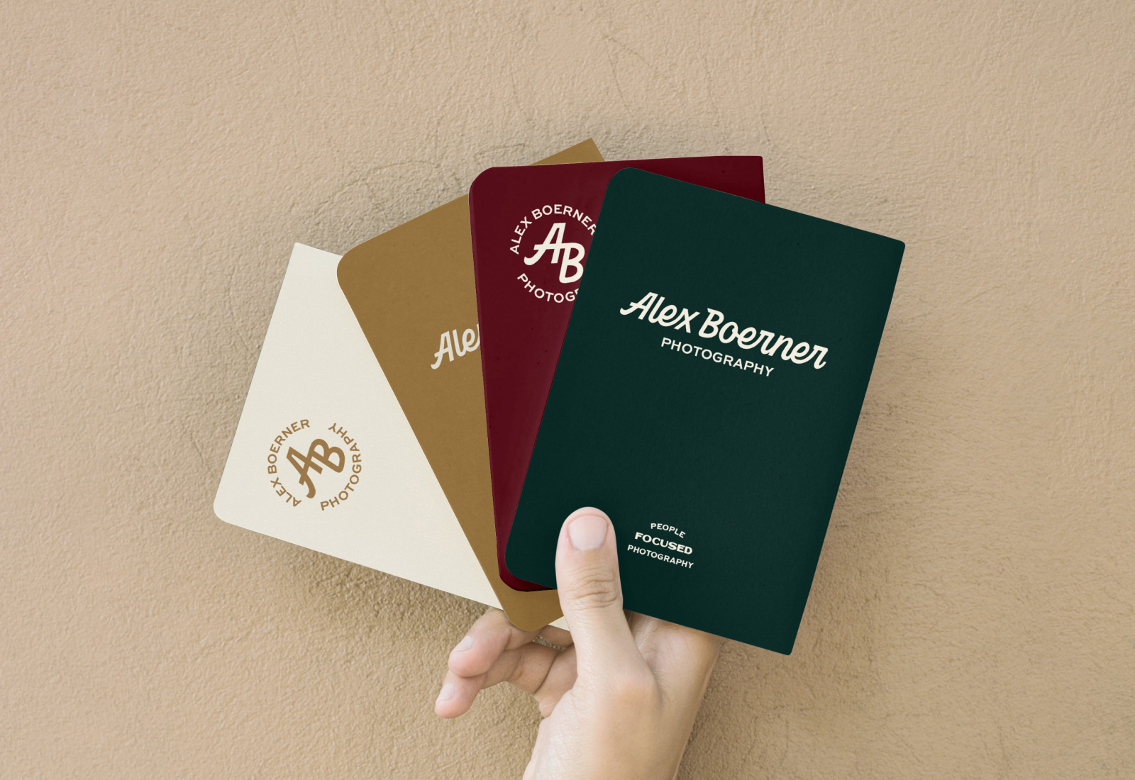
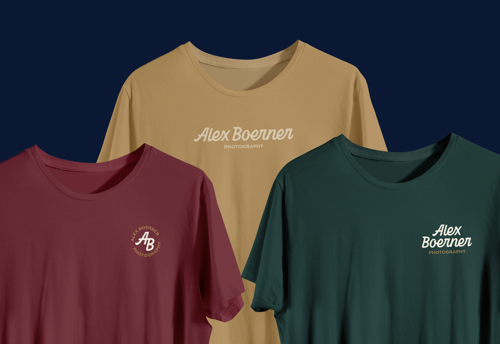
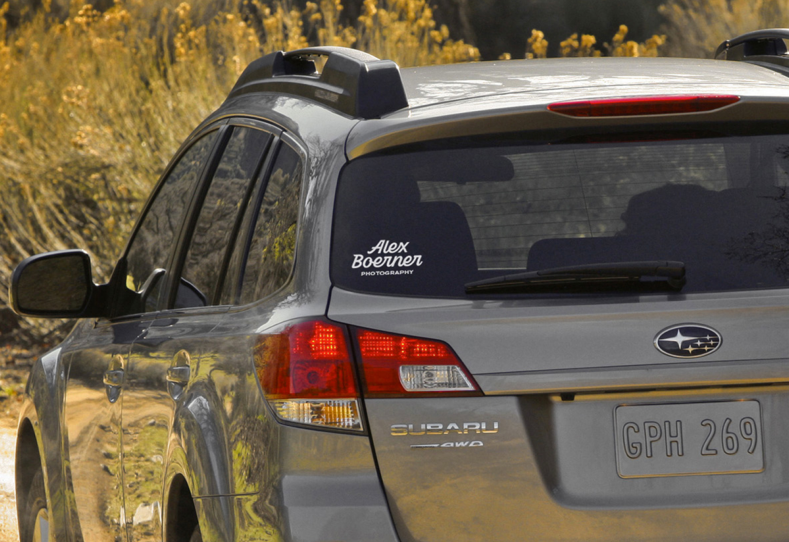
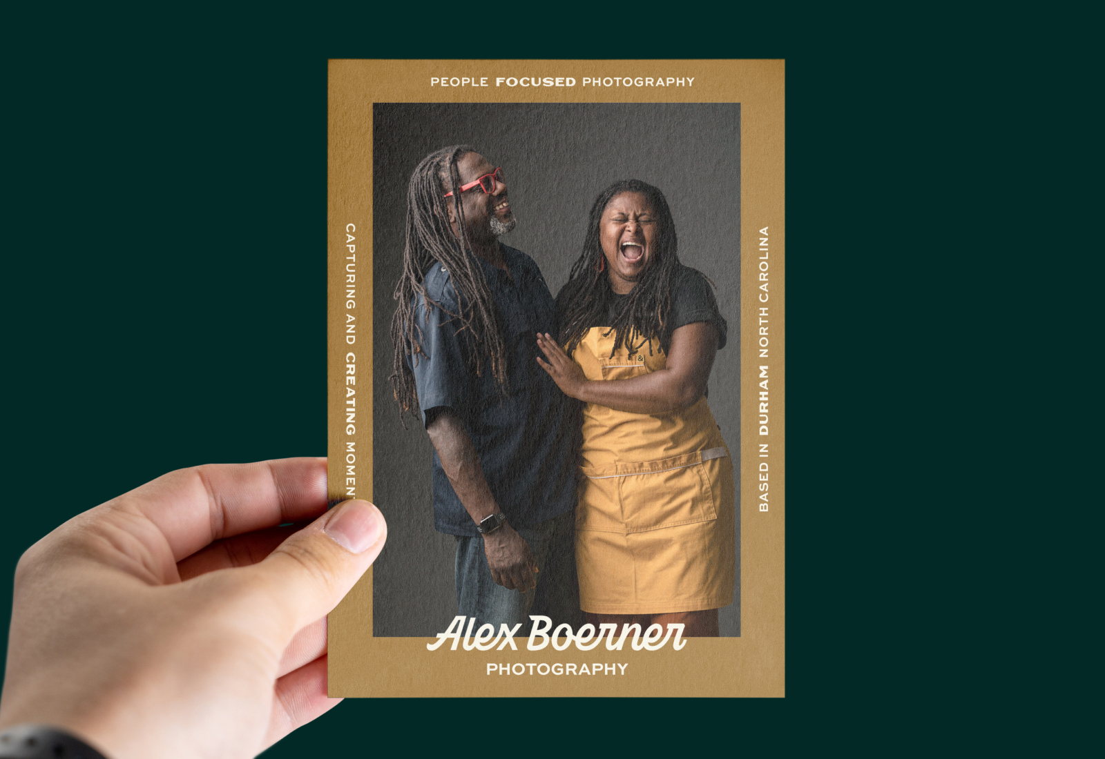
Inspired by mid-century modern design, timeless script lettering and his roots growing up in the midwest, Alex was looking for a brand that reflected his easy-going personality and the professional, handcrafted nature of his work.
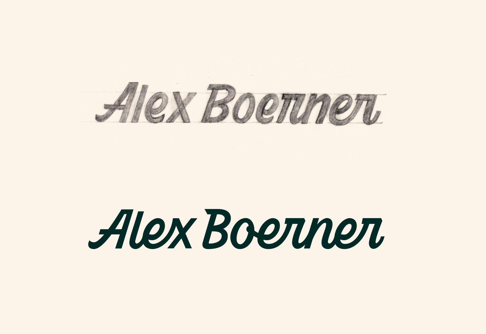
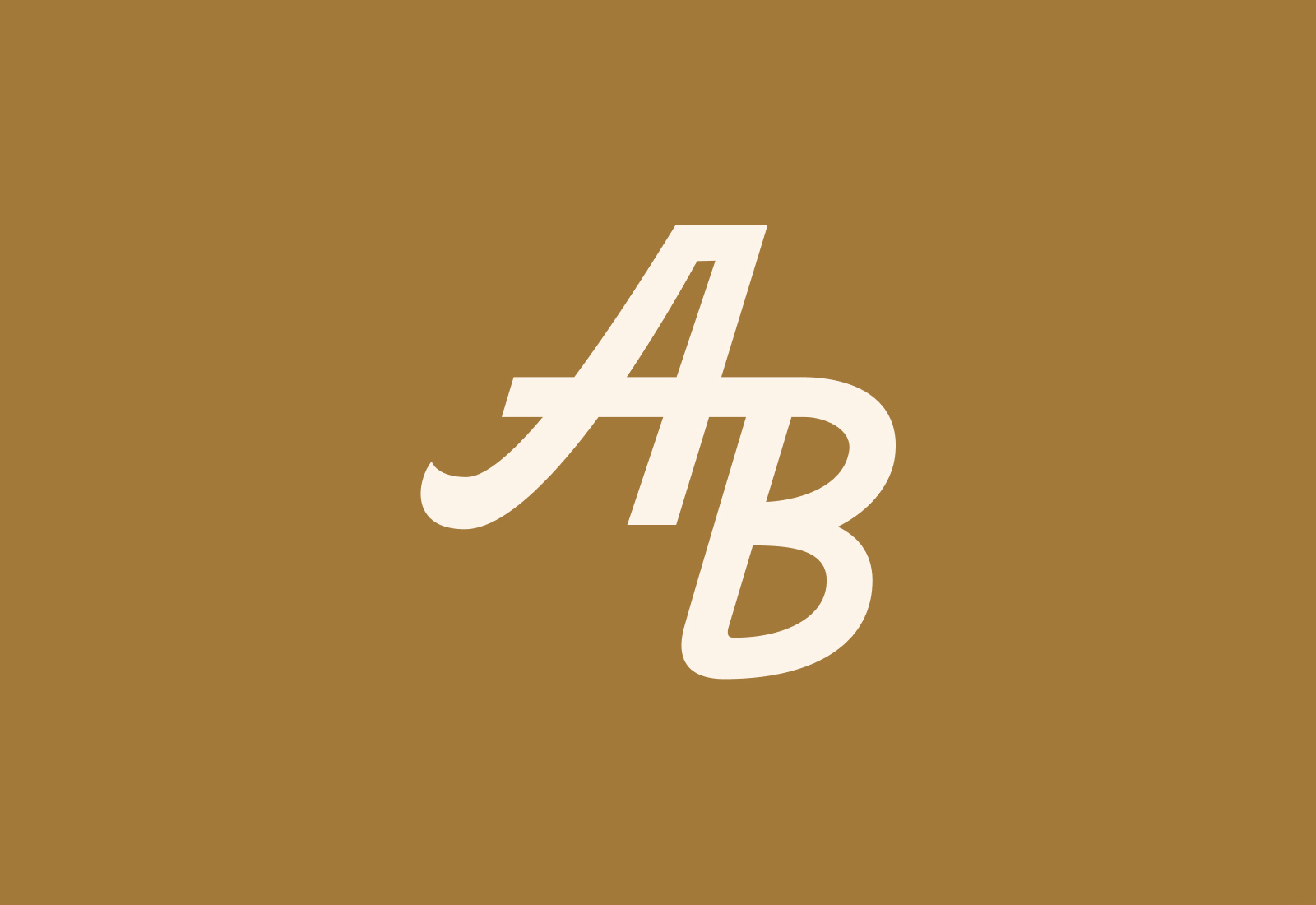
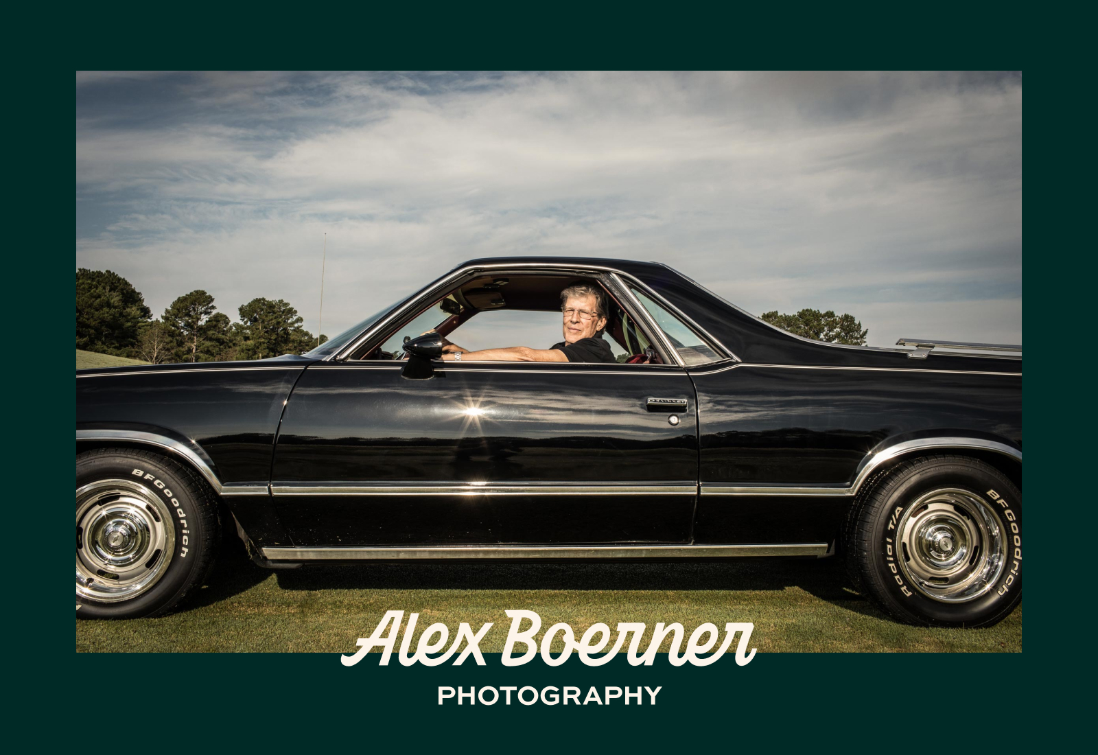
The logotype is custom lettered and encapsulates unique components from Alex’s own signature, elements from the logo of his father’s family-owned bar & restaurant (The Boneshaker), and the lightheartedness and professionalism that ring true in Alex’s work. A casual and easygoing logo for a hardworking guy.
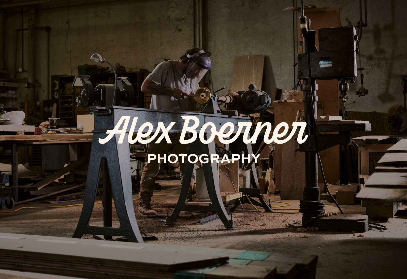
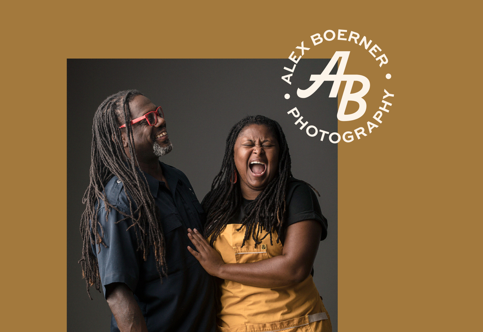
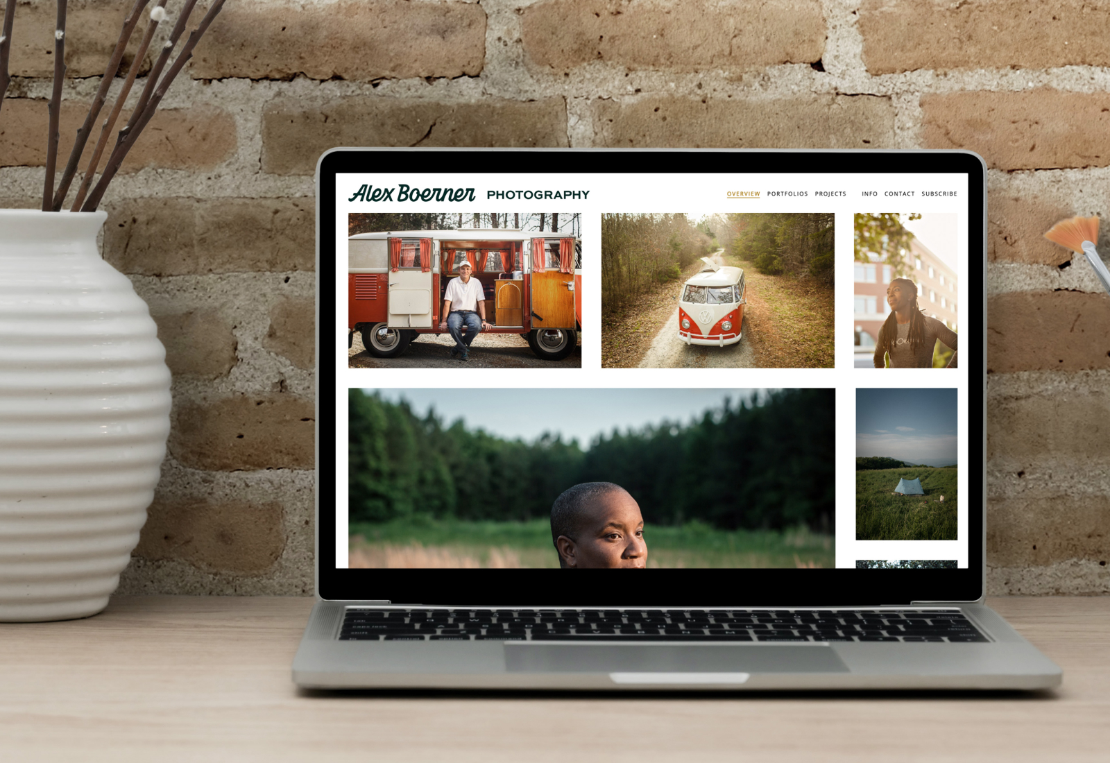
Photography shown by Alex Boerner.
“Joey’s entire process was very smooth and a completely enjoyable, pure creative exploration.”
— Alex Boerner
“What made it all extra special is that Joey created designs that paid tribute to my family’s history.”
— Alex Boerner
“Working with Joey on a brand identity update was an all-around great experience. He was able to take a bunch of loosely-connected and emotional input from me and distill all of it into a design package that really nailed the feeling that I was looking to convey.”
— Alex Boerner


